

Zara's e-commerce website bas been described as editorial to simply bizzare. Despite the importance of maintaining the brand image, there are usability issues. Through usability heuristic evaluations, the major problems were identified. The proposed redesign aims to address these issues by reducing the number of screens users need to interact with by 50%, while still preserving Zara's high-fashion, editorial brand identity.
The Problem
An e-commerce experience that confuses rather than enables
Zara is known as one of the world’s largest fast-fashion retailers, with over 2000 stores globally. However, as of 2019, their online sales make-up only 14% of their overall profits, with a goal to reach 25% by 2022. They are notorious for using large editorial styles of design that prove to be leading in the fashion industry but awful for usability as an e-commerce experience.
They have invested 3.1billion dollars into developing their e-commerce experience but the internet could not help but still criticize the overall usability of their online shopping experience. Issues stem from lack of usability to bizarre model images and stressful navigation. 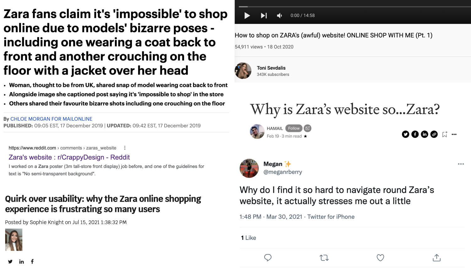
evaluating usability
Using heuristic evaluations to quickly identify usability issues
In order to create a better user experience for Zara's e-commerce website, we had to first understand why the current design failed.
To do so, we performed a heuristic evaluation based on the Nielsen Norman 10 Usability Heuristics on a general user task flow of browsing for a new product and checking out. We chose to evaluate this task as we needed to increase the potential consumer task completion, in order to help Zara achieve its goals of generating more profits from online purchases.
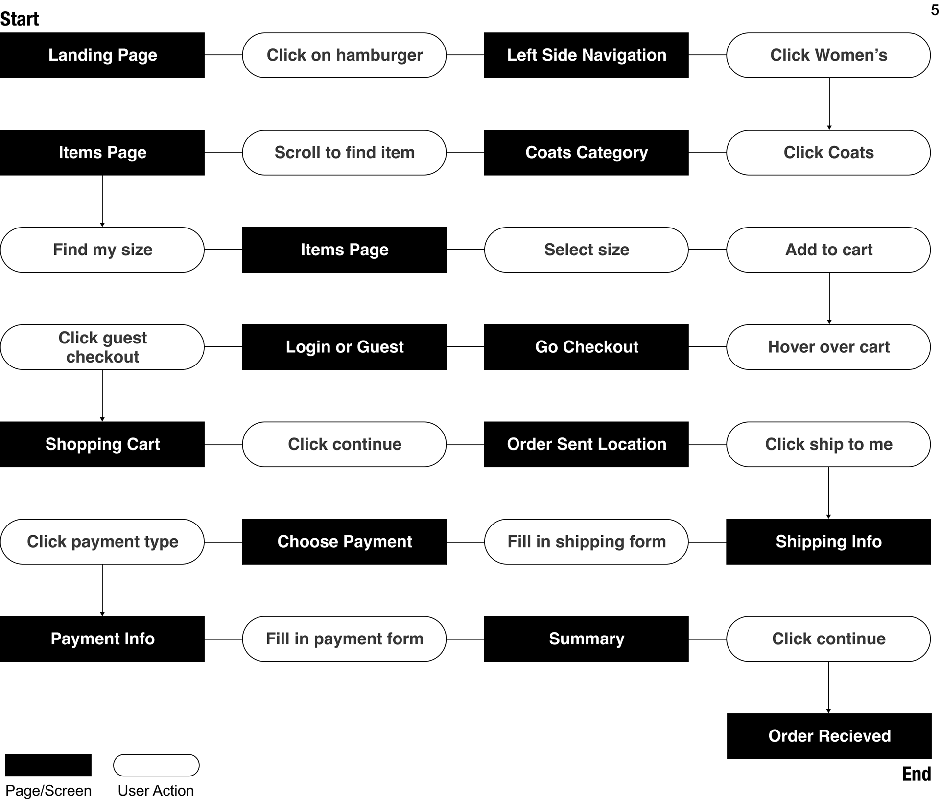
Below is our diagram for the checkout process, and as you can maybe guess, it is rather lengthy and has an overwhelming amount of screens and actions.
Defining the scope
Usability violations to pinpoint our re-design focus
We evaluated the usability of the website by ranking various parts of the task flow on how severe of a usability problem was. 0 indicated no usability issues, while 4 meant a usability catastrophe. This scale helped us quickly label and average the general usability of the site.
Below are summaries of a few heuristic violations we had identified. We decided ultimately to focus most of our design changes on the checkout process.
Too much negative space
Violates: Heuristic #8 Aesthetic and Minimalistic Design
Severity: 1 - Cosmetic Issue
Violates: Heuristic #8 Aesthetic and Minimalistic Design
Severity: 1 - Cosmetic Issue
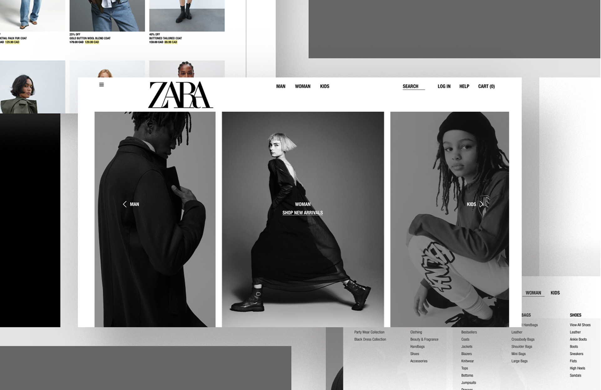
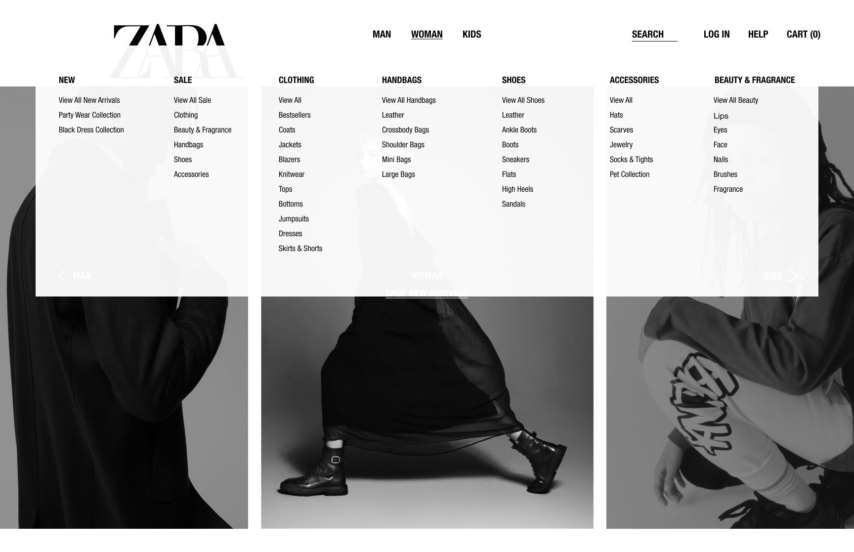
Before: the product navigation overtook the left-hand side exclusively, leaving the entire right of the screen with unused negative space.
After: We re-designed the navigation to be a mega-menu, reducing the negative space and listing out their products clearly under designated headers for ease of access.
Inconsistent browsing experience
Violates: Heuristic #4 Consistency and Standards
Severity: 3 - Major Usability Issue
Violates: Heuristic #4 Consistency and Standards
Severity: 3 - Major Usability Issue
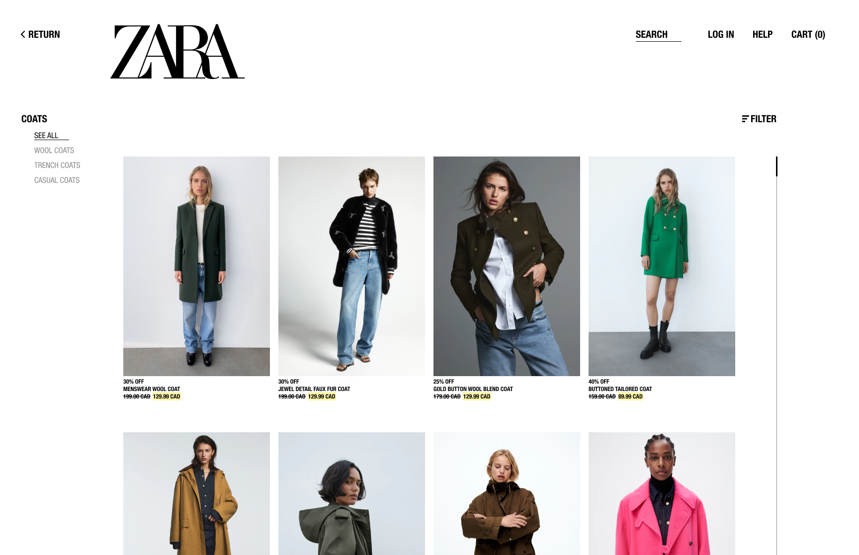
Before: lack of consistency between product display, leading to users not being able to anticipate where they should view the next product and its information.
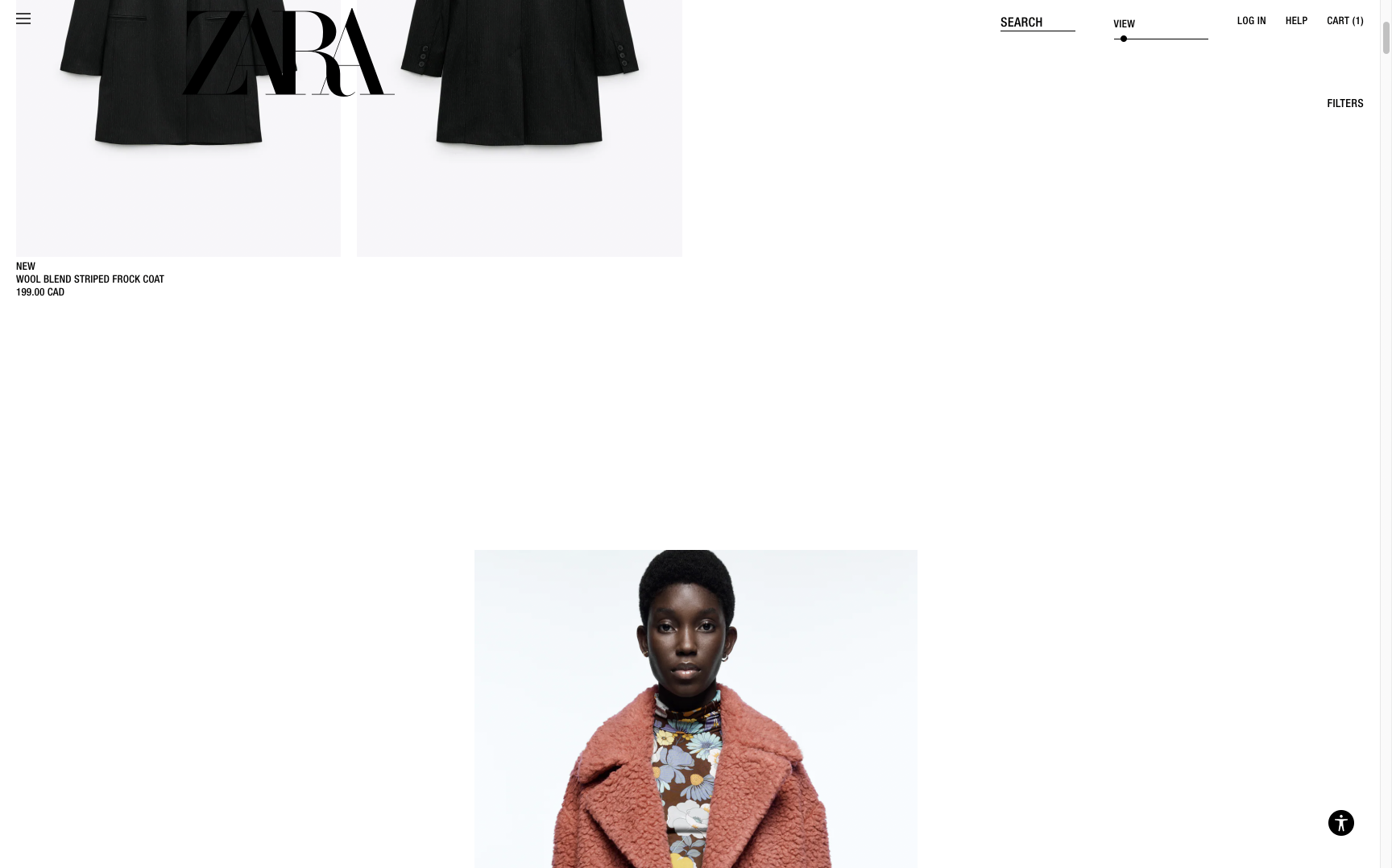
After: we laid out each product in a predictable and scannable pattern, as well as added additional navigation on the left. This allows the user to browse comfortably, while Zara can still express their style.
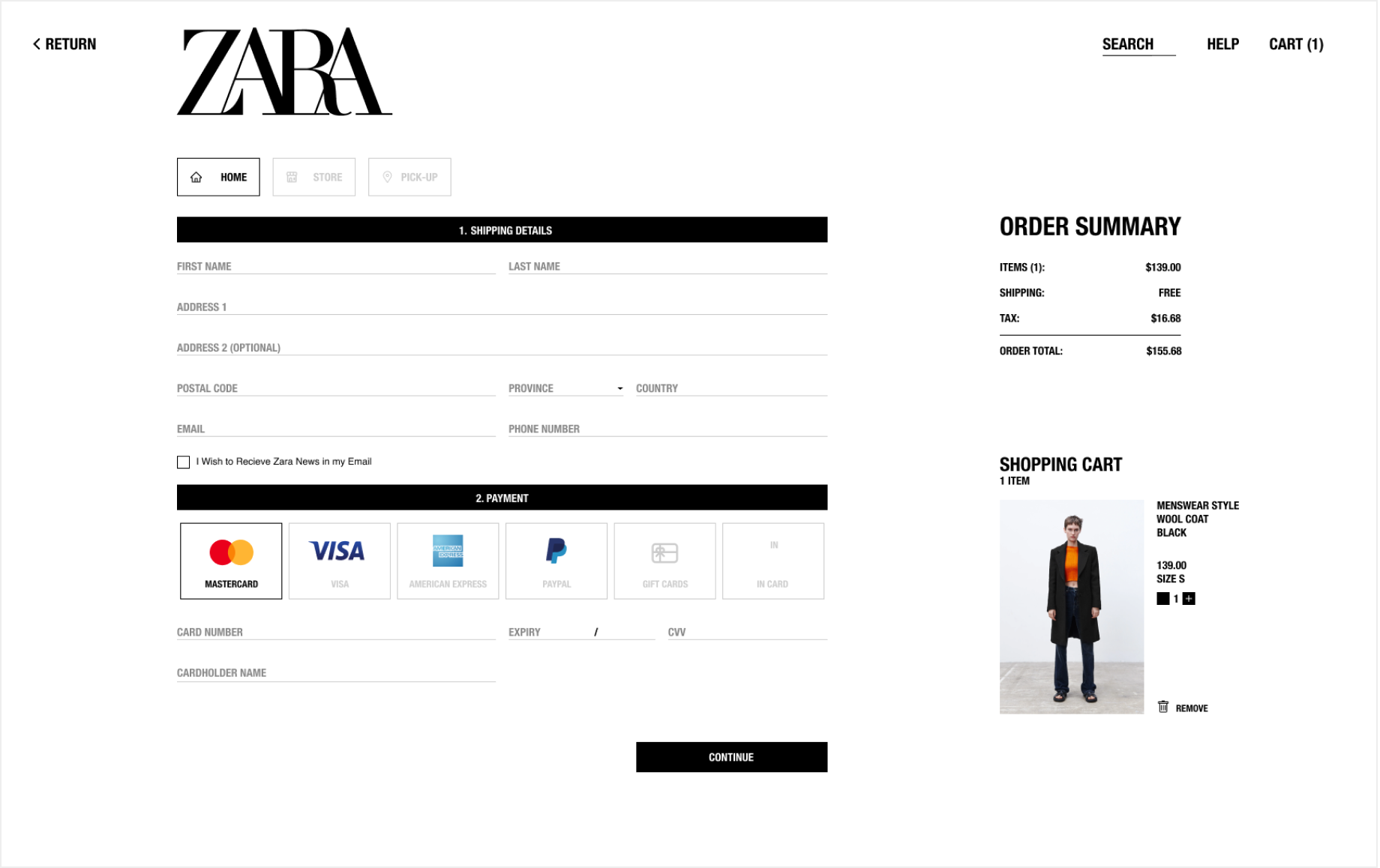
Customers cannot return nor view a previous step in the checkout process
Violates: Heuristic #3 User Control and Freedom & #5 Error Prevention
Severity: 4 - Usability Catastrophe
Violates: Heuristic #3 User Control and Freedom & #5 Error Prevention
Severity: 4 - Usability Catastrophe
Before: the checkout process took 4 distinct screens without the ability to navigate between them, leaving users frustrated and less likely to complete their purchase. This can also be thought of as a "dark pattern", which traps users in the checkout process, forcing them to proceed.
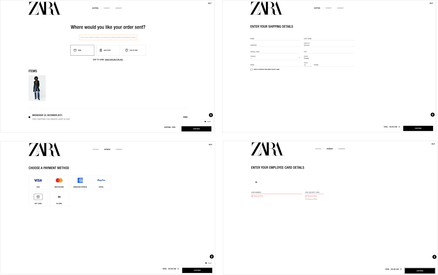
After: we re-designed the checkout process into one single screen, where the user can easily see every step of the process and ensure that their information is correct. It also gives them another chance to review their orders, avoiding other possible errors in their process.
impact
We reduced the number of customer interaction screens by 50%
After re-designing several screens of the checkout process, we re-drew the task flow and noticed that we had reduced the number of screens a user needs to view before confirming their purchase BY HALF!
This reduces the overwhelming feeling the user experiences, as well as potentially alleviating the stress of making a purchase. And hopefully with this smoother process, more customers will be inclined to make their purchases online and satisfy Zara's business needs to increase their global online sales.

Food for thought
To be stylistic or to strive for usability?
The pining question that remained after our re-design is whether it is better for brands such as Zara to stand out from others by staying true to their highly-editorial style. We think that there is a balance to strike, especially when it comes to fitting business needs. In our case, the objective of the re-design is to help Zara in achieving their goals of increasing global online sales, and the best ways to do so, from a human-centered design perspective, is to put the user and their usability first.
What do you think?